
TypeScript and React: Enforcing Props for Accessibility
typescript
Table of Contents
Recently, I added a small accessibility win to our code base.
https://github.com/open-sauced/app/pull/2035The nice thing about baking in accessibility wins into components is that it improves the accessibility of the application everywhere the component is used within the app.
The TLDR; is I added two mandatory props to our <ToggleSwitch /> component to enforce a label for the component. However, the challenge was that one of them had to be required, but not both.
The Component before the change#
The component before the change had a bunch of props, but there was no label associated with the toggle button which the <ToggleComponent /> component generated.
interface ToggleSwitchProps { name: string; checked: boolean; handleToggle: () => void; size?: "sm" | "lg" | "base"; classNames?: string;}Typically, a button will have text associated to it, but in this case, there was no text for the button which was causing the accessibility issue. When no text is present, you have a few options.
- You can have text that is only visible to screen readers and other assistive technologies. To accomplish this you can create a CSS class, e.g.
sr-onlyto move the text off the screen for sighted users, but since it’s still visible in the document object model (DOM), assistive technologies can pick it up.
Note: Tailwind is pretty popular these days, so if you go with this option, you can use the sr-only CSS class that they provide out of the box.
- You can use the aria-label attribute to provide the necessary label text, e.g.
<button aria-label="Page Visibility" type="button" role="switch" aria-checked="false" data-state="unchecked" value="on" id="isPublic" aria-labelledby="make-public-explainer" class="flex rounded-2xl p-[2px] transition overflow-hidden bg-light-slate-8 w-10 h-5"> <span data-state="unchecked" class="bg-white block rounded-2xl h-full w-1/2"></span></button>This will be used when the toggle button is announced for assistive technologies.
- You can use the aria-labelledby attribute to provide the necessary label text. Typically it’s linked to an element in the DOM that gives a description of what the element is used for.
<span id="make-public-explainer">Make this list publicly visible</span>
<!-- more markup... -->
<button type="button" role="switch" aria-checked="false" data-state="unchecked" value="on" id="isPublic" aria-labelledby="make-public-explainer" class="flex rounded-2xl p-[2px] transition overflow-hidden bg-light-slate-8 w-10 h-5"> <span data-state="unchecked" class="bg-white block rounded-2xl h-full w-1/2"></span></button>This will be used when the toggle button is announced for assistive technologies as well. The main difference is the text contents of the element with the id make-public-container will be used instead.
In our case, I opted for the aria attributes represented by the ariaLabel and ariaLabelledBy props in the component.
The TLDR;#
If you want to get to the solution right away, take a peek at these lines of code in the PR.
Attempt 1: Use a Discriminated Union Type#
A discriminated union type in TypeScript is a union type where one or more types differ on a particular property, e.g. type.
So in our case, maybe a labelType where the values could be aria-label and aria-labelledby. Although this would work, it meant adding two props to set a label. One for the labelType, and another being the label. And to be honest, this didn’t make sense for a couple of reasons. In the case of aria-labelledby, the label would be an ID for an element in the Document Object Model (DOM) vs. an actual label. Renaming this to labelOrId seemed clunky.
Attempt 2: ariaLabel or ariaLabelledBy Props#
This is really what I wanted. The component takes either the ariaLabel prop or the ariaLabelledBy prop.
I tried to keep things verbose to test the waters.
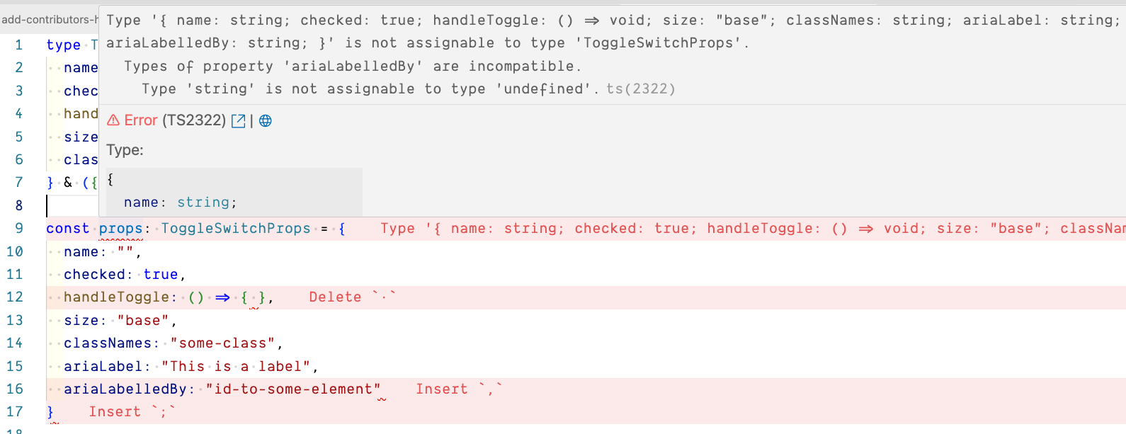
type ToggleSwitchProps = | { name: string; checked: boolean; handleToggle: () => void; size?: "sm" | "lg" | "base"; classNames?: string; ariaLabel: string; } | { name: string; checked: boolean; handleToggle: () => void; size?: "sm" | "lg" | "base"; classNames?: string; ariaLabelledBy: string; };In my head, this looked good. Narrator: “It was not”. From a quick glance, this might look good, but what this translates into is ariaLabel and ariaLabelledBy being both optional.
Take a peek at the TypeScript Playground example demonstrating this.
Since this didn’t work, I didn’t bother refactoring, but it can be shortened to this.
type ToggleSwitchProps = { name: string; checked: boolean; handleToggle: () => void; size?: "sm" | "lg" | "base"; classNames?: string;} & ({ ariaLabel: string } | { ariaLabelledBy: string });Attempt 3: Hello never Type#
I’m aware of the never type, but to the best of my knowledge, I’ve never used it explicitly. It’s always been an inferred type for me, e.g. an error being thrown.
By assigning the never type to the prop that should not be included in each type of the union, I was able to enforce the exclusivity of the props. This meant that the component could only have either the ariaLabelledBy prop or the ariaLabel prop, but not both.
type ToggleSwitchProps = { name: string; checked: boolean; handleToggle: () => void; size?: "sm" | "lg" | "base"; classNames?: string;} & ({ ariaLabel: string; ariaLabelledBy?: never } | { ariaLabelledBy: string; ariaLabel?: never });And boom! I now had what I wanted. Check out the TypeScript Playground example to see it in action.
Conclusion#
The use of the never type solved the prop exclusivity issue and had a positive impact on the component’s accessibility. Now, the component requires a label, ensured by either the ariaLabel prop or the areaLabelledBy prop, enforcing accessibility.
Never say never. 😜
Photo by Randy Rizo on Unsplash